OVO - MPANs app

So, MPAN stands for Meter Point Administration Number. Fancy, huh? But in simple terms, it’s basically your energy meter’s unique ID. It’s like your meter’s signature, helping everyone in the energy game identify and keep track of it.

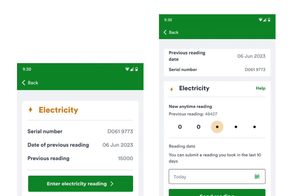
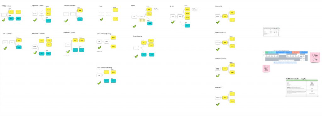
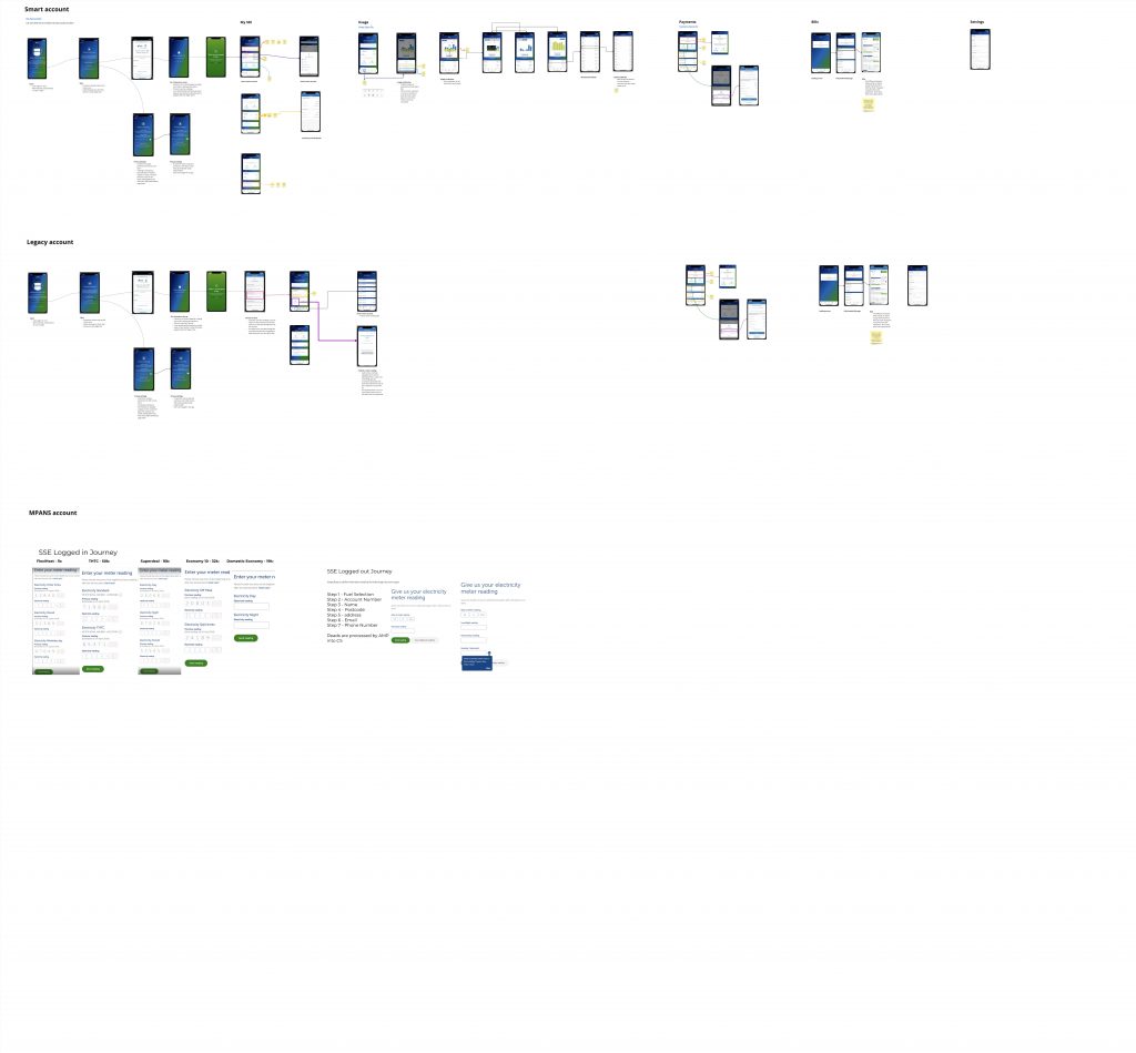
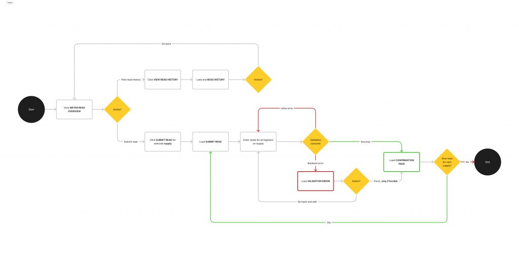
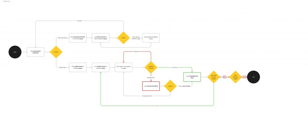
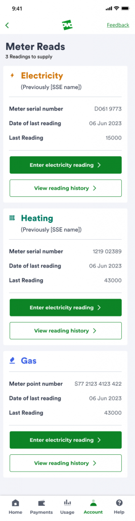
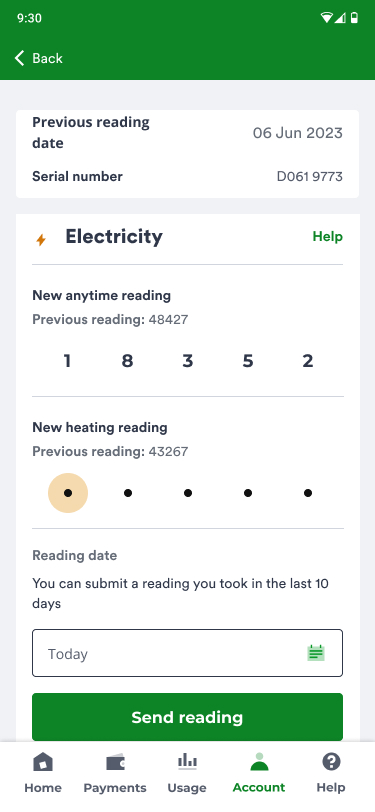
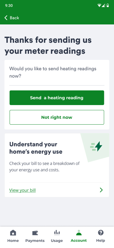
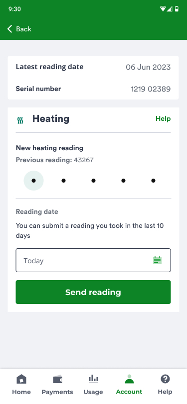
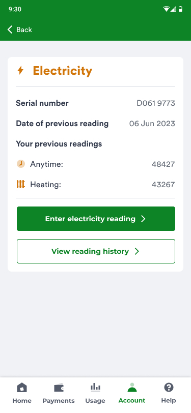
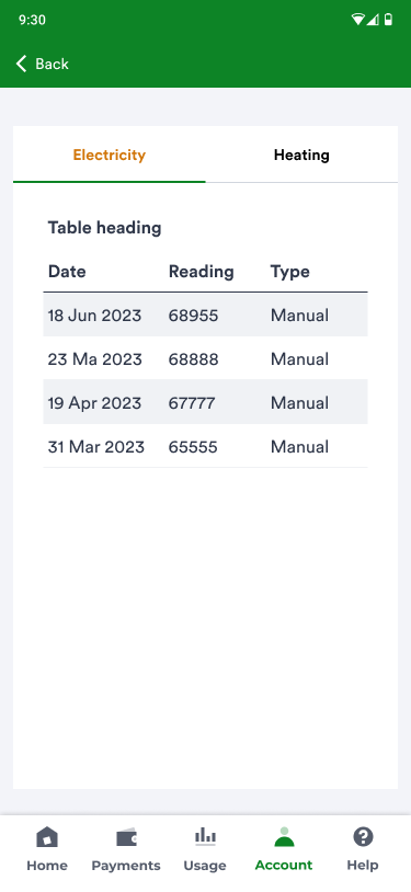
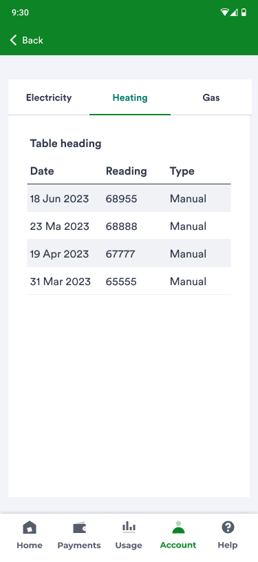
In the energy world there are multiple meter types, My role in this task was to create an app for the most complex meter types that someone may have installed in their house. Sometimes this meant a user may have 2 -3 different meters in their house, and each meter may have its own tariff (meaning each meter may be paying a different amount for energy usage). One of my biggest tasks in this project was to find an easy and clear way for users to input the correct meter reading details into the correct text field. It was time to get to work…


Step 1

The backstory

OVO recently acquired SSE, and let me tell you, SSE’s clientele  is quite distinct from the OVO users. For example SSE clientele are usually older in age and not very tech savvy whereas OVO target audience is the complete opposite demographic. Now, when these users were with SSE, they were stuck with a pretty basic app—limited to just punching in meter readings only. Meanwhile, the rest of SSE’s users had the VIP treatment with a full-fledged app. You name it, they could view bills, get predictions, and even ring up customer service—all the bells and whistles.

Now, the OVO app at that juncture? Not quite equipped for the task at hand. It lacked the functionality for users to input multiple meter readings per meter, and a slew of complex developmental challenges were in the mix. Hence, the MPAN customers needed a bespoke app tailored just for them.

Our mission was to roll out an app for OVO’s grand migration of the final SSE customers into the OVO fold – saving the most complex customers for last.

Step 1

Understanding MPANS, the users and UX research

When I first took on this task, the term “MPANs” was a bit of a newcomer to me. I’d heard it mentioned before, but understanding its ins and outs was a whole new ball game. Fortunately, OVO’s sister company, Kaluza, was already in the trenches, working on the desktop version. They had even wrapped up some insightful user interviews with internal staff who were rocking MPANs while still technically under SSE at the time. So I was able to watch some of the user interviews video, but it quickly occurred to the team and I that the users in these videos did not represent SSEs typical user as they were very technical and understood things that the average user would not because of their knowledge of the industry.

So I started by mapping out the different types of MPANS setups, how they work and the data each of the meters needed to collect:

MPAN types mapping

Next on the agenda, I proceeded to map out the SSE app, seeking to understand its user flow and become acquainted with what users were accustomed to. Following that, I shifted my focus to examining the meter reading journey of MPANs customers, paying close attention to the UI of the screening process.

This step was crucial, especially considering the previously mentioned demographic of SSE’s clientele—largely elderly individuals who may not be as tech-savvy. The goal here was to ensure a smooth transition without causing any shocks or disruptions to their usual behaviour. It was all about crafting an experience that felt familiar and user-friendly for this specific group of users.

SSE app 

As a team, we collectively decided that conducting our own research was the way to go. It quickly became apparent why Kaluza (OVO’s sister company) had opted to interview internal staff – recruiting SSE MPAN customers proved challenging as they weren’t included in OVO’s research participants hub.

Acknowledging this hurdle, we gracefully accepted defeat in terms of recruiting external participants. Instead, I delved into the original interview videos, extracting insights while maintaining a cautious perspective, always mindful to take the findings with a pinch of salt.

The key takeaway’s from the research were:

  • Users easily followed the flow that Kaluza had user tested with the participants
  • A common preference among users was to have a breakdown of their usage displayed after submitting a meter reading, aligning with what they were accustomed to at SSE.
  • Most MPANs users want of MPAN but it will cost then up to £4k per meter
  • Participants use their previous reading to identify where data needs to be inputted
  • Additionally, users demonstrated a clear understanding of MPANs and how to read their meters.(We do not think this is the case with a average user)

This is greattt!!! When can I download it

Step 2

IA

Before kicking off the design phase, the project manager and I sat down with the MOSS team (developers’ team) to discuss their strategy and identify any potential constraints that I should be aware of. During the discussion, we collectively decided to align the MPAN app as closely as possible with the existing OVO app. This approach aimed to minimize the development workload, while still incorporating necessary changes to address the complex needs of MPAN users.

Several decisions were made regarding functionality and screens that wouldn’t be part of the initial MVP. This was due to ongoing development considerations, especially in areas like displaying real-time usage data for MPAN customers, which wasn’t set up for any OVO customers at that time.

I worked on the designs of this app with a content designer.

Taking a comprehensive look, I deduced that there were two main MPAN setups:

  1. Single meter
  2. Two or more meters

Recognising the importance of the meter reading page for both users and the business, it became evident that the designs for this page needed to function differently based on the specific MPAN setup. This tailored approach aimed to enhance user experience and align with the diverse needs associated with different meter configurations.

1 meter high-level user flows

2 meters high-level user flows

I love the fact, I can see more and can potential control my energy better

Step 3: The solution

Mockups

As OVO has a great design system team, I decided that it would be faster and more efficiently to jump the wire-framing stage and jump right into design using components. I created a swim lane of designs for each MPAN setup.
Things I had decided before designing
  • Layout meter reading page similar to SSE customers seem to understand it and are happy with it.
  • Try to not make any huge changes to the SSE or OVO app experiences
  • As customers use their previous reading to identify what information goes where, the previous reading needs to be obvious

2 meters or more user flow

1 meters user flow

Landing

2 or more meter reading

Enter heating meter reading

Submission complete

Enter gas meter reading

Usage (Considering completely removing the tab)

1 meter reading

2 meters reading history

2 meters reading history

Add another reading journey 2

What happened next?

The feedback

The team’s UX researcher conducted tests on the mockups, and the feedback was highly positive. The majority of participants noted that the designs were much more modern compared to SSE, although there were some who expressed a preference for the SSE app. A standout point for everyone was the increased functionality, which they believed would assist in better managing their usage, particularly during the cost of living and energy crisis. The majority expressed excitement about gaining access to these new features.

It was also mentioned that the meter readings followed a similar flow to SSE, making it easy to use. After considering user sentiment, the decision was made to remove the usage tabs, as users were disheartened to find out that they would not be available in version 1 of the app.

The designs were passed on to the development team, but unfortunately, my contract concluded before I could witness the app go live. I’ve observed that the SSE migration is finished on the OVO side, so I can only assume the app is now in the hands of satisfied users.