The Design System

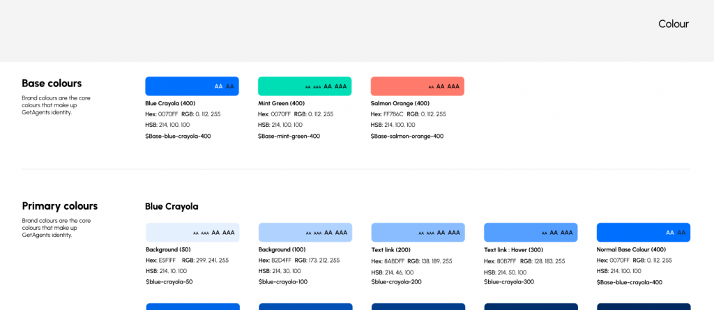
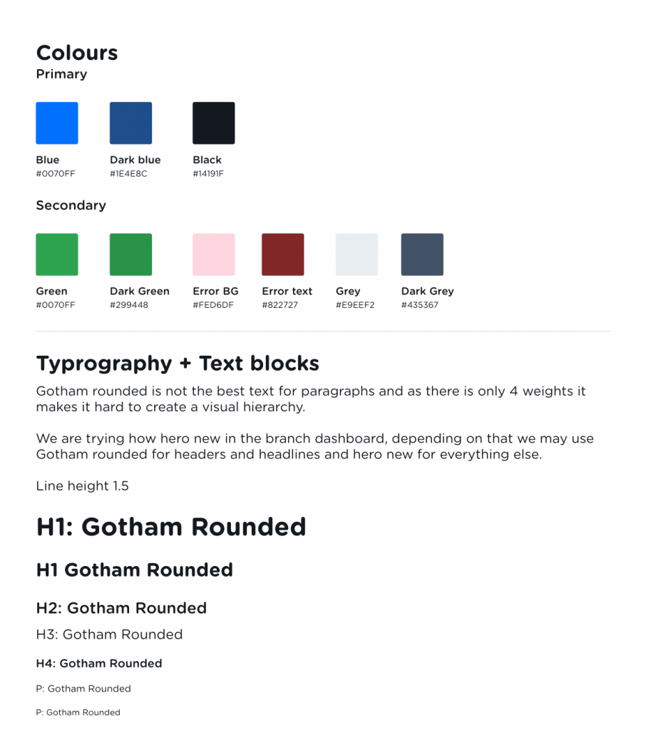
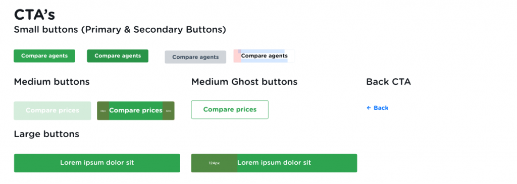
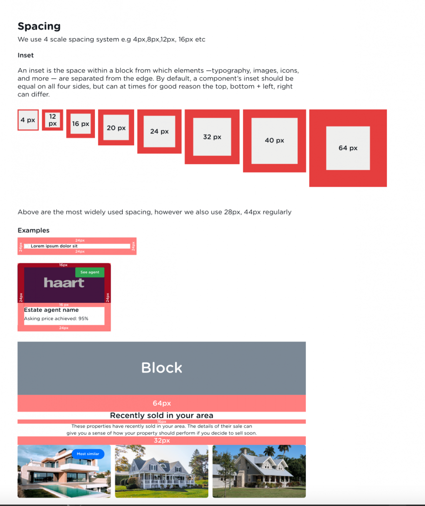
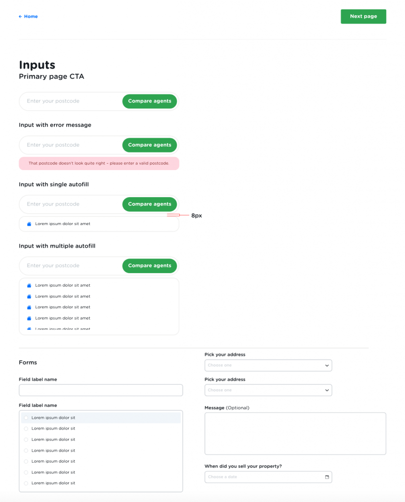
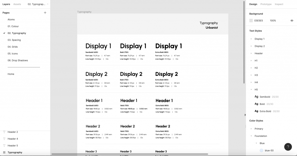
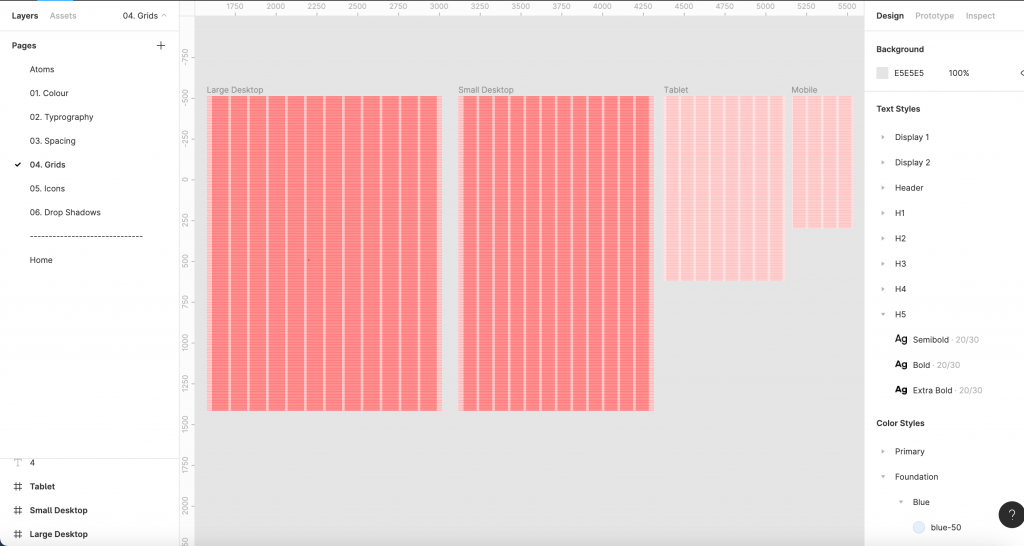
On joining GetAgent it quickly became apparent that there was no design system. In fact there was no design files at all, which made it a nightmare to design, create consistency or even understand what the designers before me rational or vision was. I had to start by create all the components that already existed on the website and work backwards – However, there were so many issues from a lack of a colour palette to text sizes on being on a scale, therefore making the hierarchy of the page unbalanced and not harmonised.

As the acting Head of Design I brought  it upon myself to create start from scratch, which meant new branding and create a new system system to ensure GetAgent foundations were stable, there was consistency across all channels and we were not building on quicksand.

Old

The original “Design system”

GetAgents Design System was a mess for both Design and Tech. The Design team were working with a design system that just did not work, it was creating more issues (both UX and UI) then doing good and the dev team were creating new components each time instead of reusing code snippets. It became obvious the bigger the product team grew that a internet based design system was required that both Design and Tech can gain access to, to ensure the designs were and development were consistent including snippets of HTML and CSS that the tech team can copy and paste.

But our old system did not allow for this as it was only on XD. So it was time to start from scratch,  this also gave myself the opportunity to correct inconstancies that I had been documenting across the GetAgent website from different shades of blue being used, to the wrong font face being used, to consistent padding on CTA being used.. plus much more.

New Beginnings

The Design System

I worked with Fortnight to moodboard and analysis in-direct and direct competitors branding, Messaging and look to determine were GetAgents branding can be improved and find quick wins.

Unlike the old design system, the new system provides token and text sizes are in scale. A 1.250 scale also known as the golden ratio was chosen as the text sizes are close to the original font size whilst maintaining consistency. It will now be extremely easy to add a new font size.

The new design system also provides 2 display fonts. These fonts will likely not be used much across GetAgents products, but by adding them into the design system now it means that the design system will not need to be broken further down the line.

The colour palette is designed with variables in mind to ensure that design and tech are inline with one and other. Each colour has a number of lighter shades and darker tones to ensure the designs will be balanced.

Other atoms within the colour tab are neutrals, semantics (error and warning colours) and charts/visuals.

The naming convention used is a mixture between logical (how the colour is to  be used) and neutral names (the colours actual name e.g Pink Rose).

A problem we had at GetAgent is our blocks were not vertically in a scale, so when I developed this design system I made sure we did not have this issue by creating vertical and horizontal grids. The grids are based on a scale of 4, which is inline with GetAgents margins, insets and squish insets.