I was contracted by TrunkBBI to redesign a very complex app for a housing app
WCHG
Award winning app
WCHG won the Housing technology award 2026, for the app and online portal, I designed.
70%
reported that it’s easier to pay their rent
95%
said the app makes it easier to manage their financial accounts
The brief
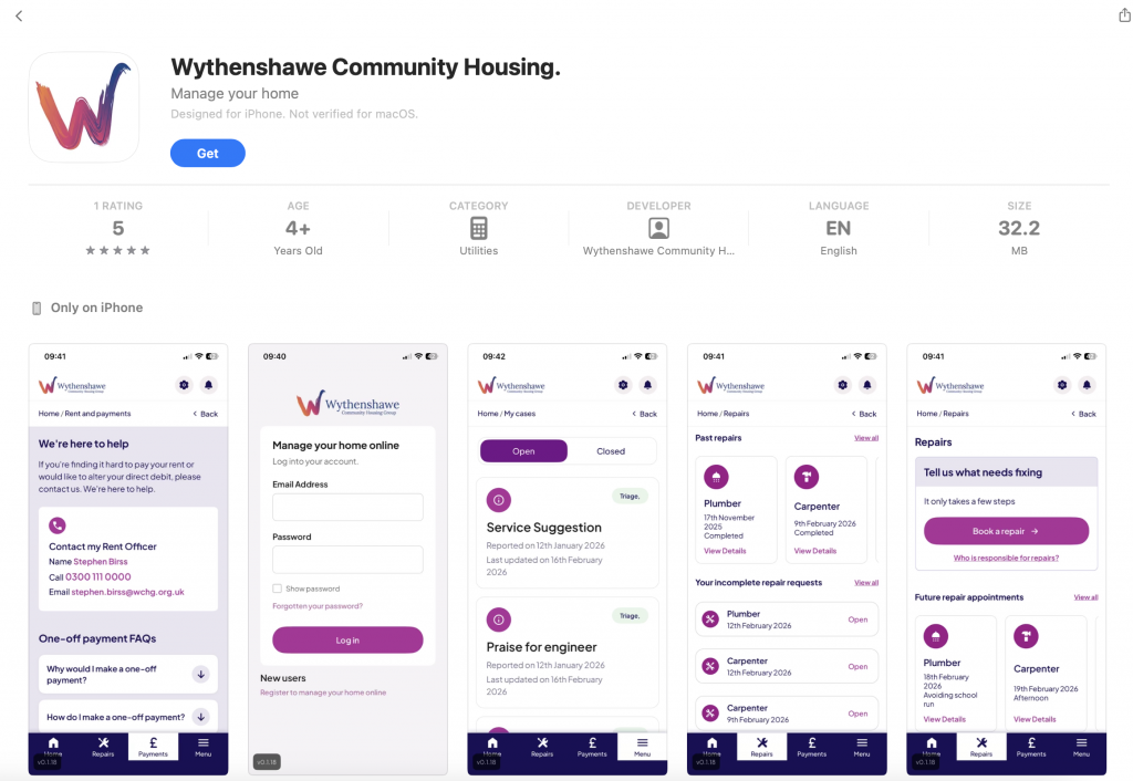
The app needed a revamp
I was brought in by TrunkBBI to improve the usability of their clients existing resident app. Originally contracted to focus on UX improvements, the scope evolved into a full visual redesign, resulting in a complete UI overhaul.
The primary challenge? Most users were aged 70+, with limited confidence using digital tools. The existing app created friction at almost every touchpoint, which reduced engagement and increased reliance on offline support channels.
The goal was simple but high stakes:
Make the app genuinely usable for older residents, not just “technically functional.”
The problem
The existing app wasn’t just frustrating — it was actively creating barriers for residents.
Key usability issues included:
-
Small text and low contrast, making content difficult to read
-
Complex navigation with important features buried several layers deep
-
Overloaded screens with no clear visual hierarchy
-
Inconsistent UI patterns that reduced familiarity and trust
-
Language that assumed a level of digital literacy many residents didn’t have
For a user base largely aged 70+, these weren’t minor inconveniences. They became stopping points.
The impact went beyond user frustration:
-
Tenants were falling behind on rent
-
Residents were coming into the office to pay in person
-
Rent payments were often delayed because the app felt too difficult to use
The technology intended to increase digital independence was instead driving offline reliance and operational strain.
This made the redesign more than a cosmetic update — it became a service-critical intervention.
Desk research
Additional Research Efforts
This was a highly collaborative discovery phase.
I worked closely with Trunk’s Director of UX and UX research team, alongside WCHG’s technical lead, innovation lead and product managers. Together, we defined clear personas and mapped out the primary use cases for the app, grounding every design decision in real resident behaviours rather than assumptions.
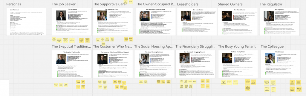
WCHG had already conducted years of resident research on their side. We consolidated those findings and aligned on the core functionality that genuinely mattered. This resulted in a prioritised feature tracker, which became our central working document throughout the project. It acted as both a scope control mechanism and a decision-making framework during the design process.
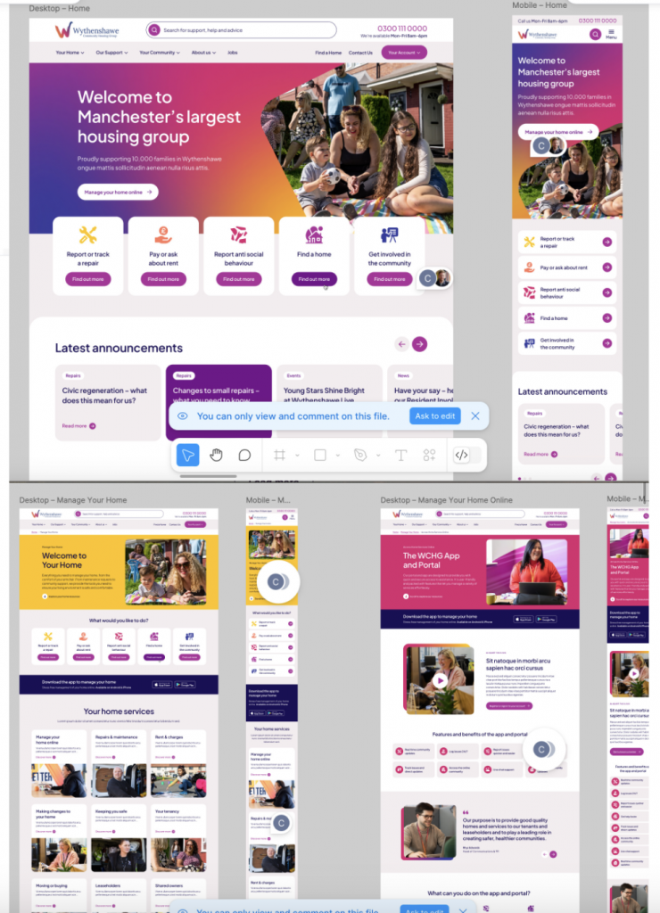
At the same time, WCHG was undergoing a website redesign. To ensure consistency across the digital ecosystem, the visual direction of the app was intentionally aligned with the evolving website brand and component system. This influenced typography, colour, spacing and overall UI patterns — creating a cohesive digital experience rather than two disconnected products.
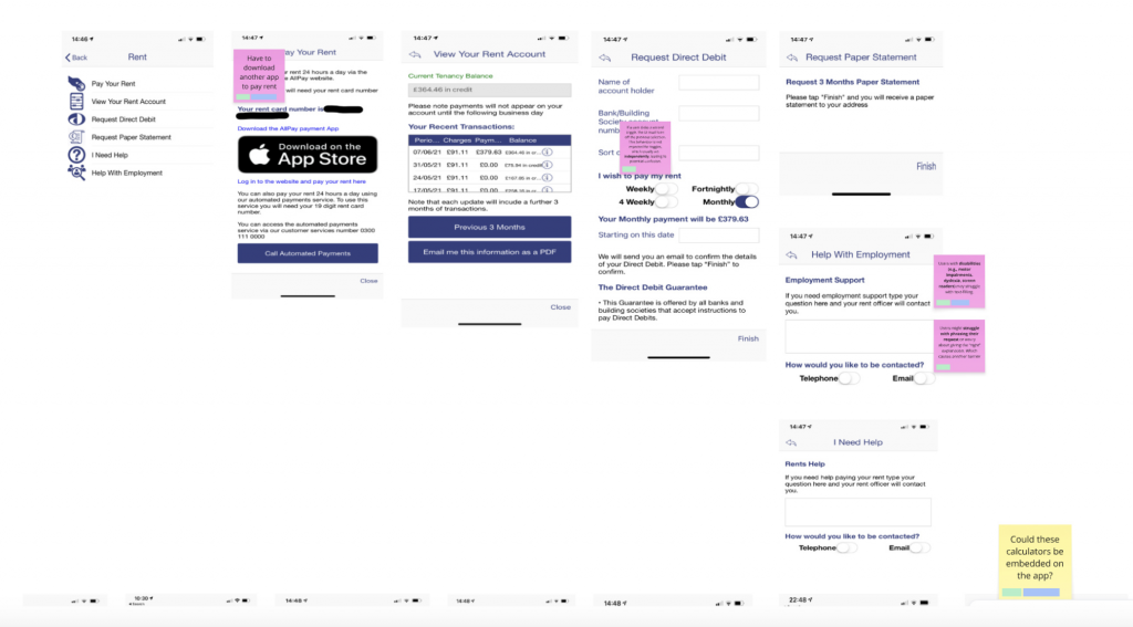
Alongside stakeholder workshops, I conducted a thorough audit of the existing app. This included:
-
Reviewing user flows to identify friction points and drop-offs
-
Assessing accessibility gaps (contrast, type size, hierarchy)
-
Mapping inconsistencies across navigation and UI patterns
-
Analysing where cognitive overload was occurring
It became clear that the issues weren’t isolated — they were systemic. The structure, content and interface were all contributing to user confusion.
To add context beyond WCHG, I reviewed broader social housing engagement data and digital adoption patterns. A consistent theme emerged across the sector: older residents disengage quickly when digital processes feel complex, particularly around finances. Late rent payments and increased in-office visits were common symptoms of poor digital usability, not unwillingness to adopt technology.
At the same time, WCHG was redesigning their website. The app couldn’t exist in isolation, so the visual direction was intentionally aligned with the evolving web brand and component system. Typography, colour, spacing and UI behaviours were influenced by this parallel transformation to ensure a cohesive digital ecosystem.
To further strengthen the strategy, I conducted a focused competitor analysis. I reviewed how similar housing and finance-based apps approached their most complex features — particularly those flagged in our feature tracker as high-risk areas.
The goal was to:
-
Identify proven industry UX patterns
-
See how complex financial journeys were simplified elsewhere
-
Anticipate usability risks before committing to design
-
Proactively sidestep accessibility issues
By combining internal research, app auditing, sector analysis and competitor benchmarking, I entered the design phase with clarity; not just about what needed changing, but why.
This app is really easy to use, I find very easy to work out what I need to pay
Design Approach
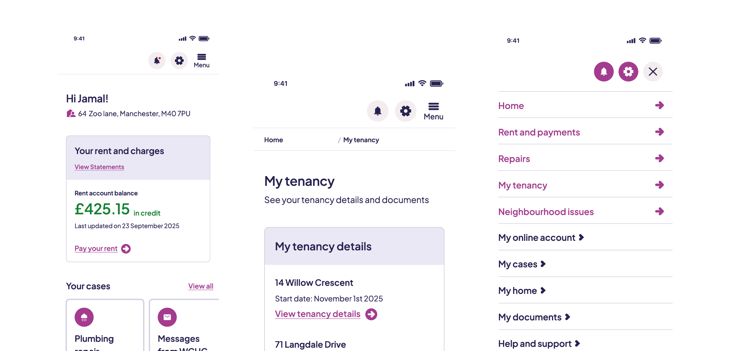
1. Radical Simplicity
Every feature was stripped back to its essential purpose. If it didn’t serve a clear user need, it was removed or restructured.
2. Accessibility by Default
Not as an afterthought , as the foundation.
-
Larger tap targets
-
Clear, high-contrast colour palette
-
Scalable typography
-
Plain English throughout
3. Confidence-Driven UX
The app needed to feel safe and forgiving.
-
Clear feedback states
-
Obvious primary actions
-
Reduced decision points
-
Simple, linear flows
The Design
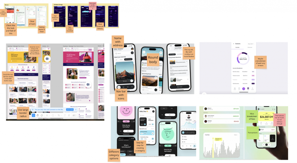
Originally scoped as a six-week UX project, this piece of work evolved quickly once momentum built.
After completing the first section of the website, I presented the direction to the Director of UX. With alignment secured and the website UI signed off, the brief shifted. Rather than continuing to wireframe the remaining areas of the app, I was asked to move directly into high-fidelity UI for the rest of the product.
This meant accelerating the process, skipping formal wireframes and designing straight into polished screens, while still applying UX thinking throughout. Every decision was grounded in established patterns from the earlier discovery phase, user flows we’d already validated, and the design principles defined at the outset.
Working this way required a more iterative approach:
-
Stress-testing layouts in real time rather than in low-fidelity.
-
Making interaction decisions within the visual layer.
-
Continuously sense-checking usability without the safety net of separate wireframe stages.
It was a shift from structured exploration to confident execution. Because the foundational UX thinking was solid, I could focus on refining hierarchy, clarity, and interaction within the UI. Ensuring the experience remained intuitive, even as the process became more streamlined.
In short, the project transitioned from pure UX discovery into a hybrid execution phase: UI-led delivery, powered by embedded UX principles.
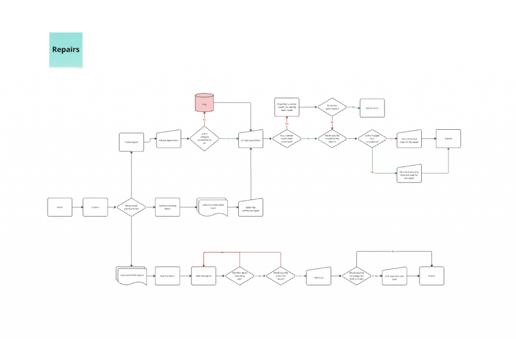
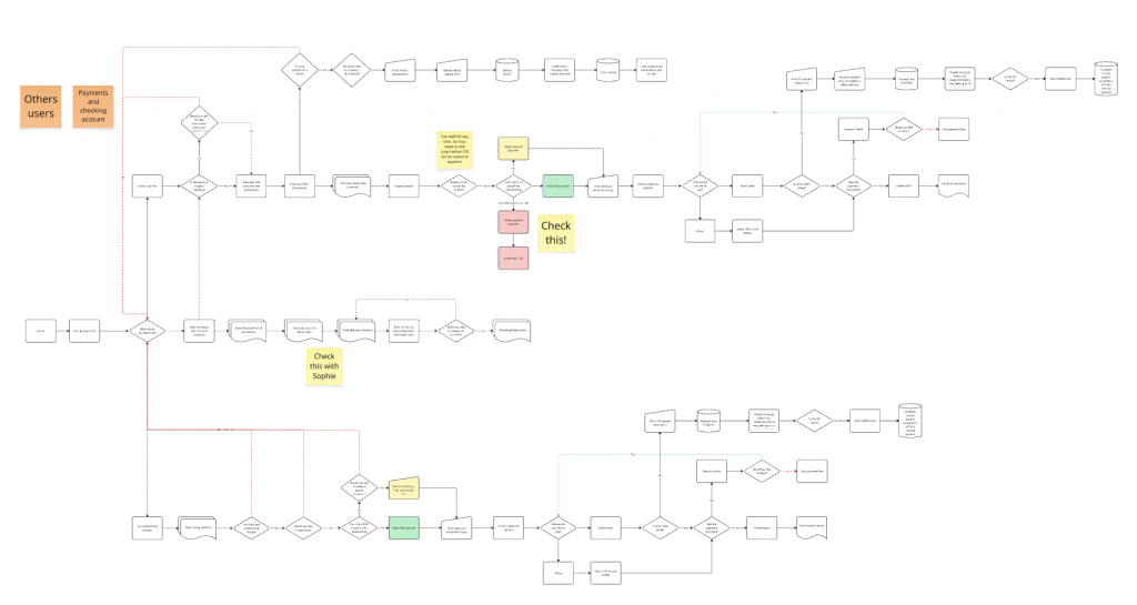
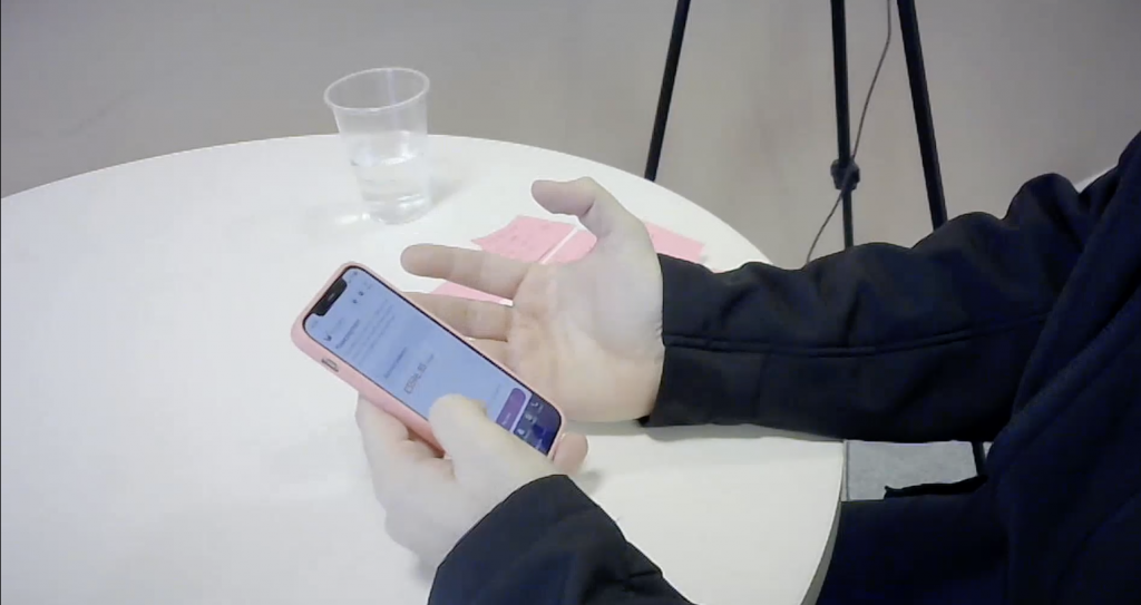
Testing the app
We ran usability testing with 10 WCHG residents/tenants to see how the app held up in the real world — not just in Figma fantasy land. Overall? It landed well. The core journeys were smooth, intuitive, and people were able to complete key tasks without hand-holding. That’s always the real benchmark.
There were three tasks that needed refinement, and honestly, no surprises there. They were already flagged during UX as “this might get messy” moments.
1. Setting up and amending a Direct Debit
This surfaced early in the UX phase. WCHG weren’t entirely clear on how their internal system would process changes to Direct Debits, which meant we had to design with a degree of ambiguity. We built a flow that could flex depending on system constraints, but testing confirmed that the handoff between app and back-office logic needed tightening.
2. Changing a Direct Debit date
Same theme, different flavour. Internal system rules weren’t fully defined, so we designed around potential limitations. During testing, users completed the task — but it exposed friction where system behaviour wasn’t fully aligned with user expectations. A classic “front-end clarity vs back-end reality” scenario.
3. Deleting a WCHG payment account
Again, payment-related. Again, internal complexity. We anticipated edge cases here and designed defensively, but usability testing confirmed that clearer feedback and confirmation states were needed to build confidence in what was happening behind the scenes.
The key takeaway? The friction wasn’t about usability fundamentals, it was about system logic. We’d already sensed those pressure points during discovery, and testing validated that instinct. The foundation of the app works. The refinements were about aligning internal processes with a user experience that feels simple, transparent, and trustworthy.
In short: strong core, predictable edge cases, and clear next steps. Exactly what you want from a testing phase.

App launch
The app has been live since mid February on both App and Google app stores
This the app has been live and the feedback from testing, these were the high-level insight:
40% less calls to pay rent
80% of residents tested said the app was easy to use
70% reported that its easier to pay their rent
95% said the app makes it easier to manage their financial accounts
These dates are from 23rd Feb 2026